
Existing patterns first
Use local S-block and component conventions before adding new abstractions.
We can't find the internet
Attempting to reconnect
Something went wrong!
Hang in there while we get back on track
KUK Design Clifford
Diese Seite sammelt die wichtigsten visuellen Grundlagen und wiederverwendbaren CMS-Blocks. Sie dient als Kitchen-Sink fuer Designentscheidungen, QA und kuenftige Komponenten.
Foundation
KUK UI is daisyUI-first, Tailwind-extended, token-aware, editorial calm and strongly readable.
Use local S-block and component conventions before adding new abstractions.
Use btn, input, select, card, join, badge and semantic theme roles before adding project-local CSS.
Editors choose content and curated variants, not raw colors, spacing or arbitrary styling.
Rules
Use daisyUI as the primary component and theme system.
Use Tailwind for layout, spacing, typography utilities and small extensions.
Centralize typography, spacing, layout, color, motion and ratios in tokens.
Prefer daisyUI classes like btn, input, select, card, join and badge for UI controls.
Keep project wrappers thin aliases to daisyUI, not custom component reimplementations.
Do not use arbitrary colors, font sizes, spacing, inline styles or custom HTML in CMS content.
Do not auto-transform text to all caps unless authored that way.
Use Regular as default font weight and Semibold for headings and important controls.
Let editors control content and curated variants, not raw design parameters.
Tokens
Desktop-first type scale. Mobile generally maps one token smaller. Body copy stays at least 16px mobile and 18px desktop.
| Token | Size | Line height |
|---|---|---|
| xs | 14px | 20px |
| sm | 16px | 24px |
| base | 18px | 30px |
| lg | 20px | 32px |
| xl | 24px | 34px |
| 2xl | 28px | 36px |
| 3xl | 32px | 40px |
| 4xl | 40px | 48px |
| 5xl | 48px | 56px |
| Desktop | Mobile | Change |
|---|---|---|
| 5xl | 4xl | 48px -> 40px |
| 4xl | 3xl | 40px -> 32px |
| 3xl | 2xl | 32px -> 28px |
| 2xl | xl | 28px -> 24px |
| xl | lg | 24px -> 20px |
| lg | base | 20px -> 18px |
| base | sm | 18px -> 16px |
| sm | xs | 16px -> 14px |
Font-size and line-height tokens live in Tailwind v4 @theme
and are surfaced as project classes.
--text-base: 1.125rem;
--text-base--line-height: 1.875rem;
--leading-base: 1.875rem;
Layout
Use a 4px system. Shared section, stack, container and grid tokens keep CMS blocks aligned.
1
2
3
4
6
8
12
16
24
32
48 / 64px
64 / 80px
80 / 128px
8px
16px
24px
32px
48px
Page
Every Halo3 S-block uses one shared inner container. Text uses Content width by default and may use the narrower, centered Prose width where reading measure matters.
75rem
100% of container
42rem
Use `sblock-container` for S-Blocks and hardcoded page shells that must align with them.
Content width and background treatment are independent. A theme can reach the page edge or remain inside `sblock-container`.
Use viewport-wide inner content only for deliberate visual separators and immersive media such as photo galleries, video, maps or graphics. Editorial text remains constrained.
The image or video remains fullbleed. Headlines, copy and CTAs always sit in `sblock-container`, using Content width by default and optional Prose width. On compact viewports the hero grows to fit its content; 16:9 starts at the `md` breakpoint.
The optional `page_toc` block turns the following top-level S-Blocks into a 1/4–3/4 reading layout on desktop. Its daisyUI menu stays in the left column and marks the section currently in view. Glass, solid and gradient-blur surfaces keep the same content geometry; mobile keeps the normal single-column flow.
edge / contained
content / prose
visual only
Content width and background width can be combined independently. These examples use the same classes as production S-Blocks.
Content width
This text follows the selected Content or Prose width. Its surrounding surface remains independent of the text width.
Default for headings, grids, listings and mixed layouts. The white surface spans the block; content follows the shared page frame.
Prose width
This text follows the selected Content or Prose width. Its surrounding surface remains independent of the text width.
Long-form copy uses a centered 42rem reading measure while the DaisyUI theme reaches both page edges.
Content width
This text follows the selected Content or Prose width. Its surrounding surface remains independent of the text width.
The page remains white while the themed surface is constrained to the shared container.
daisyUI
Use daisyUI semantic roles. Default visual direction: minimal flat design, little shadow, clear surfaces, calm contrast and sparse accents.
Components
First CTA uses primary, second CTA uses secondary. Prefer daisyUI classes directly; project wrappers should stay thin aliases.
These aliases should compile to daisyUI button styling, so radius, border, depth and theme behavior stay controlled by the active daisyUI theme.
<a class="button-primary">Tickets ansehen</a>
<a class="button-secondary">Konzertreise anfragen</a>
<a class="button-primary-inverse">Auf hellem Bild</a>Use daisyUI btn classes as the source of truth. Project aliases should not redefine radius, border, shadow or focus behavior.
daisyUI theme tokens define controls, form widgets, icon buttons, badges and quick system UI.
First action: primary. Second action: secondary. Accent is sparse and should not become the default CTA color.
CMS
Longer CMS content should use project-styled Tailwind prose. CMS content should not carry arbitrary design code.
Standard prose is calm, readable and uses project tokens. Links are visible and underlined. Example link.
Editorial quotes stay restrained and readable.
prose prose-kunstkultur
H2, H3, paragraph, bullet list, numbered list, link, quote, image, simple table.
Free colors, free font sizes, custom HTML, inline styles, all caps and spacer blocks.
Quality
Bodycopy must be at least 16px mobile and 18px desktop.
Smallest text is 14px.
Touch targets must be at least 44px by 44px.
Maintain strong contrast for text and buttons.
Provide visible focus states.
Do not identify links by color alone.
Preserve semantic heading hierarchy.
Respect prefers-reduced-motion.
Motion
Motion should feel editorial and quiet: light reveals, hover transitions, restrained zoom, accordions and sparse section reveals.
150ms
250ms
400ms
cubic-bezier
cubic-bezier
Restrained image hover
Surface transition
Media
Use explicit aspect ratios and make CMS image expectations clear. Motifs should be safe-area tolerant.
16:9, hero, stage images, wide teasers
Editorial, event cards, venues
Logos, portraits, compact cards
Portraits, artists, people
Process
Use this before finishing UI changes.
Check whether existing tokens/classes already cover the need.
Add reusable tokens/classes centrally when a pattern repeats.
Keep CMS editor choices curated.
Rebuild CSS after Tailwind class or token changes.
Verify typography, spacing, contrast and focus behavior on mobile and desktop.
Keep the /styleguide page and clifford-kuk-design skill in sync.
Open
These areas are named by the skill but still need sharper rules in the next iteration.
Inputs, labels, validation, form layouts and CMS-connected forms.
Card density, backgrounds, full-bleed behavior, section spacing and content widths.
Header, menu states, footer variants, social buttons and newsletter UI.
Curated settings, image-ratio help text, variant naming and anti-footgun defaults.
Sharper roles for primary, secondary, accent and themed section backgrounds.
Per-block design contracts and examples for production content.
CMS
Compact inventory of common S-blocks and their curated settings. Use this as the checklist before adding new block-level design controls.
| S-Block | Variants | Layout / width | Theme background | Typical use |
|---|---|---|---|---|
| Text | ||||
| rich_text | prose content
|
prose wide
|
default primary secondary accent neutral
|
Longer editorial content sections |
| animated_statement | continuous flow editorial line breaks centered spotlight
|
viewport-height Content width staggered one-time reveal
|
default primary secondary accent neutral
|
Large linked brand statement or section transition |
| page_intro | editorial staggered draggable atelier
|
large abstract lively image compositions
|
default primary secondary accent neutral
|
Emotional and informative abstract after a page hero |
| page_intro_variants | interactive comparison
|
editorial staggered draggable atelier
|
default primary secondary accent neutral
|
Temporary on-page comparison of all Page Intro layouts |
| page_toc | scroll-aware menu
|
desktop 1/4 navigation 3/4 following content
|
default
|
Long pages with several consecutive S-Block sections |
| accordion | content faq
|
prose / wide single open multiple open
|
default primary secondary accent neutral
|
FAQ and structured detail content |
| timeline | timeline entries
|
default wide
|
default primary secondary accent neutral
|
Process, schedule, journey |
| Media | ||||
| single_media | image CMS video YouTube
|
content wide full aspect ratios
|
none
|
Single visual or video embed |
| image_gallery | slider grid
|
default wide full ratios grid modes
|
none
|
Impressions and editorial media |
| downloads | download cards
|
internal files external files
|
none
|
PDFs, presskits, documents |
| Data display | ||||
| event_listing | all upcoming featured
|
cards list grouping
|
default primary secondary accent neutral
|
Concert/event listings from CMS or backend data |
| stats | default compact editorial
|
1-4 items
|
none
|
Hardcoded metrics and highlights |
| experience_ratings | curated 1-5 ratings
|
fixed 5 categories
|
default primary secondary accent neutral
|
Experience profile and quick comparison |
| location_map | compact default large
|
compact map medium map tall map
|
none
|
Venue, route options, directions |
| tour_map_accordion | interactive stop accordion
|
compact map medium map tall map
|
none
|
Sample tours and route storytelling |
| team | grid editorial
|
manual members
|
default primary secondary accent neutral
|
People and contributors |
| testimonial | video grid quote grid
|
1-6 items
|
default primary secondary accent neutral
|
References, quotes, proof |
| Mixed | ||||
| hero | standard editorial split
|
hero layout CTA pair key visual
|
none
|
Page entry with text, CTA and media |
| hero_slider | image event_id videoloop
|
slides Content / Prose text autoplay counter
|
fullbleed media
|
Landing hero, tours, seasonal campaigns |
| feature_block | icons images background images
|
grid bento default / wide
|
default primary secondary accent neutral
|
Cards, benefits, offers |
| Conversion | ||||
| conversion | cta newsletter download
|
Content / Prose edge / contained
|
default primary secondary accent neutral
|
CTA, request, lead capture placeholder |
Architecture
Additional S-Blocks are a supported full-stack extension point. A definition creates the CMS contract and generated editor; a convention-based renderer provides the frontend.
`00_{slug}.ex` declares slug, picker metadata, tabs, fields, defaults, translations and embedded item lists with `MavuHalo3.Sblock`.
Standard fields automatically receive backend inputs, validation and canonical form conversion. A bespoke CRUD screen is not required.
Halo3 stores a closed string-keyed map containing `sblock_type` and only fields declared by that type. Defaults are inherited safely.
The generic pipeline expands translations, media, links, defaults and visible embedded items before rendering.
`10_{slug}_c.fe.html.ex` receives `render_data` and `context`. Halo3 discovers it by naming convention and wraps it as a full-width S-Block.
generated
canonical
discovered
shared
required
required
when limited
when dynamic
required
defmodule MyApp.Sblocks.ProgrammeNotes do
  use MavuHalo3.Sblock

  sblock do
    slug "programme_notes"
    label "Programme Notes"
    picker_group :default
    picker_order 40
  end

  fields do
    tab :content, "Content" do
      field :headline, :text, required: true, translatable: true
      field :body, :htmltext, translatable: true
    end

    tab :settings, "Settings" do
      field :width, :select,
        default: "wide",
        options: [wide: "Content", prose: "Prose"]

      field :color_theme, :select,
        default: "default",
        options: MyApp.Sblocks.SectionTheme.field_options()

      field :surface_width, :select,
        default: "full",
        options: MyApp.Sblocks.SectionTheme.surface_width_options()
    end
  end
enddefmodule MyApp.Sblocks.ProgrammeNotesC do
use MyAppWeb, :html
attr :render_data, :map, required: true
attr :context, :map, required: true
def main(assigns) do
assigns = assign_new(assigns, :d, fn %{render_data: data} -> data end)
~H"""
<section class={["py-16", MyApp.Sblocks.SectionTheme.section_class(@d)]}>
<div class={["sblock-container", width_class(@d)]}>
<div class="prose prose-kunstkultur max-w-none">
<h2>{@d.headline}</h2>
{raw(@d.body)}
</div>
</div>
</section>
"""
end
defp width_class(%{width: "prose"}), do: "sblock-content-narrow"
defp width_class(_d), do: "sblock-content-wide"
endRendered blocks
The Page Intro comparison switches one shared abstract between three genuinely different compositions: Editorial, Versetzt and the draggable Atelier. The following blocks continue the visual system test for independent content and background widths.
Viele Stimmen begegnen einander und werden in wenigen intensiven Tagen zu einem gemeinsamen Klangkörper. Professionell begleitete Proben führen zu großen Werken an ikonischen Orten. Der Moment, in dem alles im Konzert zusammenfindet, bleibt weit über den letzten Ton hinaus.
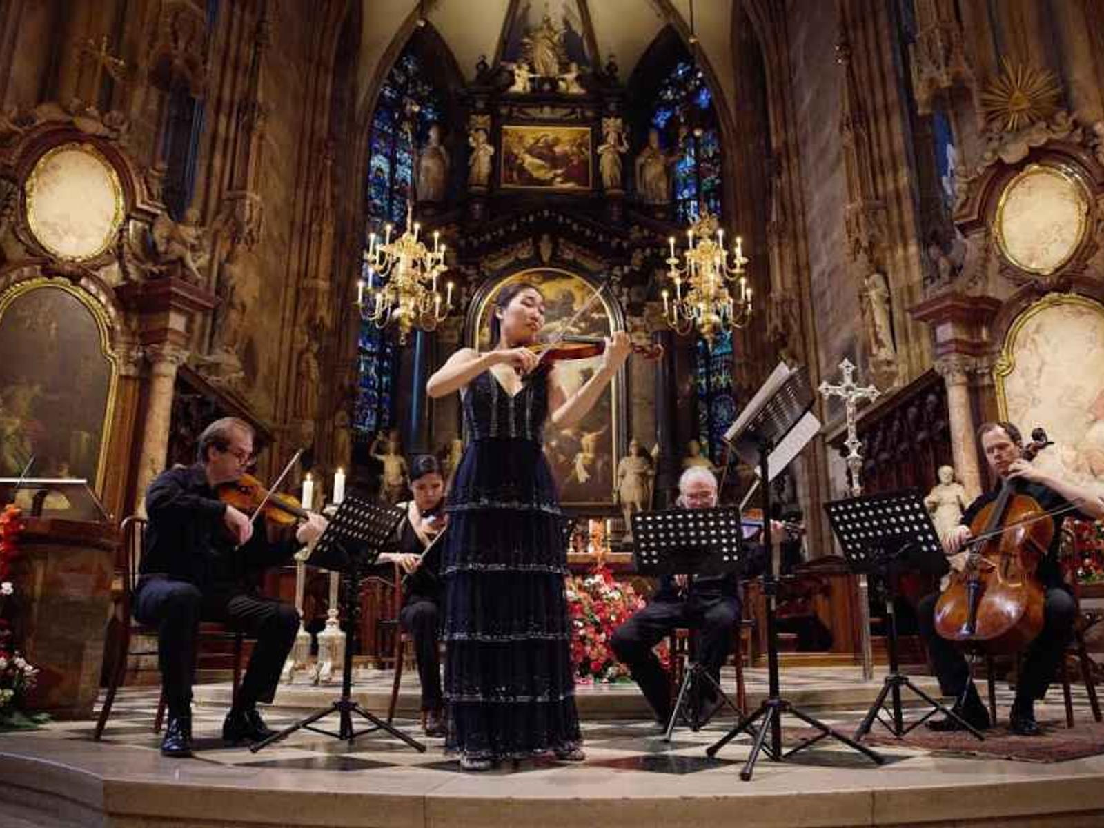
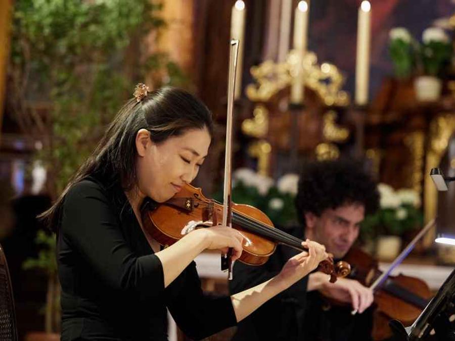
Viele Stimmen begegnen einander und werden in wenigen intensiven Tagen zu einem gemeinsamen Klangkörper. Professionell begleitete Proben führen zu großen Werken an ikonischen Orten. Der Moment, in dem alles im Konzert zusammenfindet, bleibt weit über den letzten Ton hinaus.
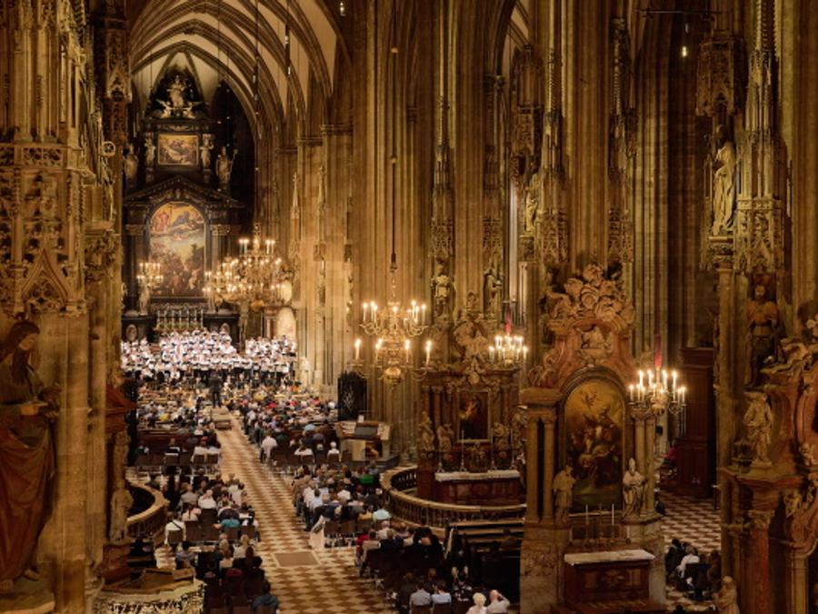
Viele Stimmen begegnen einander und werden in wenigen intensiven Tagen zu einem gemeinsamen Klangkörper. Professionell begleitete Proben führen zu großen Werken an ikonischen Orten. Der Moment, in dem alles im Konzert zusammenfindet, bleibt weit über den letzten Ton hinaus.
Featured block
Prueft Fullbleed, Hintergrundfarbe, Kartenraster, Icons und semantische Typografie.
Editoriale Teaser mit ruhiger Hierarchie.
Sakrale Raeume, Konzertsäle und besondere Spielstaetten.
Chöre, Orchester und musikalische Reisegruppen.
Kuratiert, klar und ohne rohe Designparameter.
Dieser Block prueft Prose, Lesebreite und farbige Fullbleed-Sektion. Lange CMS-Texte bleiben tokenbasiert und nutzen keine Inline-Styles.
Erlaubt: Absätze, Links, Listen, Zitate und einfache Tabellen.
FAQ variant
Prueft Inhaltsbreite, Trennlinien, Icons, offene Panels und Themesection-Kontrast.
Text, Linien und Icons sollen mit dem aktiven Theme sauber lesbar bleiben.
color_theme nutzt die kuratierten SectionTheme-Werte.
Bei FAQ- und Detailbloecken, die nicht zu schmal wirken sollen.
Conversion
Prueft CTA-Fokus, Panel-Kontrast, Formular-Platzhalter und Band-Rhythmus am Seitenende.
Newsletter Placeholder
Formularintegration folgt spaeter. Der Button nutzt bis dahin den Link-Picker.
Komponentenbeispiel
Zahlen und kurze Aussagen bleiben ruhig, grosszuegig und scanbar.
Feste Erlebnisdimensionen
daisyUI Rollenfarben
Zentrale Review-Seite